After me and Jim went over the initial characters for the short story, we discussed that we could showcase the five different effects Jim wants to rig within this short story. The two hoovers would the mechanical rig, and the other four effects i can apply to the dust mites, creating not just one dust mite character and repeat it but have a whole variety of dust mite species and make some taller, ones that roll, jump, fly ect, this will cover all of the five rigging techniques Jim want to create and keeping all the characters within one story, by doing this all the characters are relevant, have a narrative and background and are not just random doodles.
Jim will be writing up the final story as it has changed and developed a few times, this will help us keep focused on what our goal is and what we need to produce. This will be a set of five short clips from this short story showing each rigging technique, for example one clip would show a hairy character clinging onto the rug as it is getting sucked up by the hoover, this will showing the movement in the hair being pulled.
Characters to develop and what to consider for each:
Old Hoover:
wheezing tartan bag.
coughing dust.
flickering light.
stiff and rusty.
Dyson Hoover:
Lights
Dot matrix
Steam
Material
Exaggerate hoovers functions ( extra compartments)
Dust Mites:
Jumping
Flying
Rolling
Blobby
Fat
Small
Tall
Long
Strong
Weak
Thursday, 18 March 2010

Wednesday, 17 March 2010


Final boards submitted
These are the final boards i have submitted for the D&AD awards.
Board one: Final product.
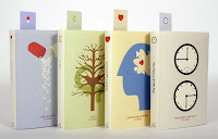
Board two: Layout of book cover designs.

Board three: Promotional work for the H.G Wells collection.

Board one: Final product.

Board two: Layout of book cover designs.

Board three: Promotional work for the H.G Wells collection.

Final product Shot
After selecting the final picture i adjusted a few levels to make the photograph more brighter.


Final product Shot
I had taken a variety of shots for the final book covers, the aim was to show the consistency of them working as a set and to show the book marks i designed for each book.
After taking some shots of the books piled upon one another i took a step and realized i was not even showing the illustrations i had done for each book, all the photo was showing was the spines, book marks and one cover design?


I have tried a few ways of which i could show the book cover designs and book marks. I also realized about the back of the book can not be seen in the photo so i have tried turing one of the book on its front so the back is visible.


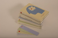

After positioning the books this way i feel the photo is still not doing the book covers any justice so i have decided to align all the books the show the consistency and how the book marks work with the set.


After taking some shots of the books piled upon one another i took a step and realized i was not even showing the illustrations i had done for each book, all the photo was showing was the spines, book marks and one cover design?


I have tried a few ways of which i could show the book cover designs and book marks. I also realized about the back of the book can not be seen in the photo so i have tried turing one of the book on its front so the back is visible.


After positioning the books this way i feel the photo is still not doing the book covers any justice so i have decided to align all the books the show the consistency and how the book marks work with the set.


Promotion
To promote the release of the H.G Wells collection i have mocked up some possible places were the advertisement could be seen. The symbols i am using for the spines and book marks of the books have been made into promotional posters which i have applied to bus stop advertisements. I have used these symbols for a window display of a book store and applied the symbols to a book stores website, i feel the symbols hold a very strong consistency.
To target the requested younger audience i have also mocked up an e book which will enable you to read the book on the iphone.


To target the requested younger audience i have also mocked up an e book which will enable you to read the book on the iphone.


Subscribe to:
Posts (Atom)